
Bradesco Health – Doctor’s Website
Overview
Bradesco Health is a health insurance company from Bradesco bank. At this project, we receive the challenge to renew the website used by the doctors that are associated with Bradesco Health.
🛠 Role: UX Designer Consultant.
The project
Bradesco is one of the biggest brazilian banks and besides their banking services, they also own a health insurance company called Bradesco Saúde (Bradesco Health). That company make partnership with doctors and sell health insurance plans for the community. When you get sick, you look for a doctor and, if you are part of Bradesco Health, you can be served by one of their doctors. Frequently, you don’t pay anything to the doctors, only for Bradesco Health and they transfer an amount of value for the doctor.
That complex network requires a complex system to be managed. And here is when The Doctor’s Website comes to life.
The Doctor’s Website is a place where all doctors can manage their financial reports, follow the exam requests that they request approval for Bradesco, look if the patient can be served by them. To make a long story short is the place where doctors can manage everything related to their partnership with Bradesco Health.
Discovery & Research
I joined this project after this phase. I’ll talk about this important step though. All the discovery processes were done by my team worker at IBM, Larissa Machado. The text above is my understanding after reading her report.
After a workshop using Design Thinking methodologies and some user interviews, we discovered that the users of the doctor’s website were not doctors themselves but their officer assistants which were 99% women, with ages between 25 and 38. After that discovery we come up with a list showing their most common pains which were:
Delays at process (exam requests) feedback, e-mails alerts showing if the process was denied or accepted, lack of caption (hint) at the systems, bad positioning of systems, and the number of pop-ups.
The doctor’s website is a huge platform and, as you can see, there were a lot of problems to solve. So, we decided to renew it in phases.
After identifying all these problems, we rank the most used system related to them to tackle.
The old Doctor’s Website
Design & Development
With our real user and their problems in mind, we started the design process of the website. Back then, we clearly had the list of the principal systems that we need to re-design, but how the user is going to access them? Because of that, we decided that the first thing that we are going to renew was the home page so that way the user can navigate to the systems.
We also renewed the architectural information on the website. The old website used to have a disorganized menu and distribution of information. We did that reformulation to the user find the information their need in an easy way.
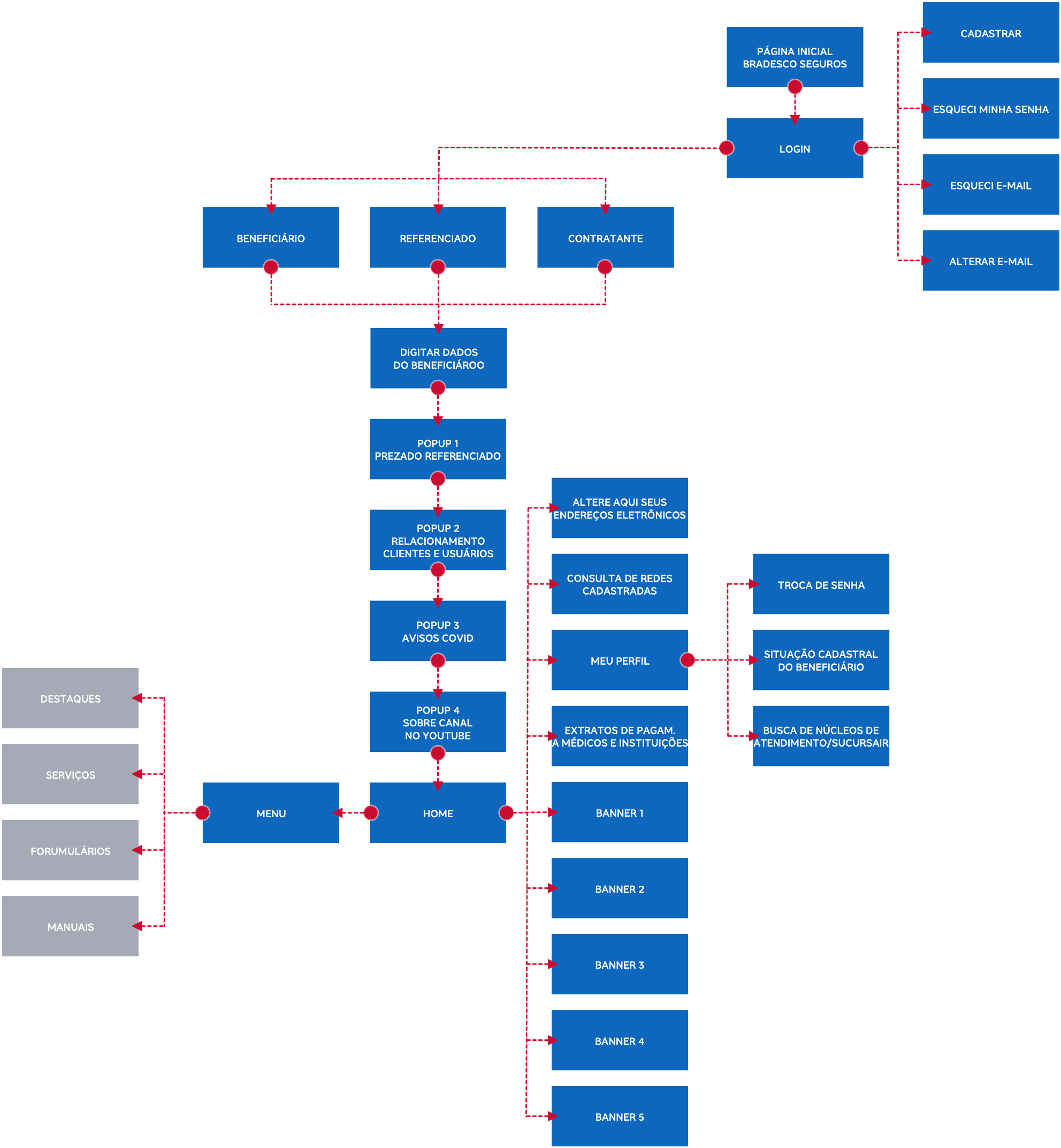
Architecture as is. |
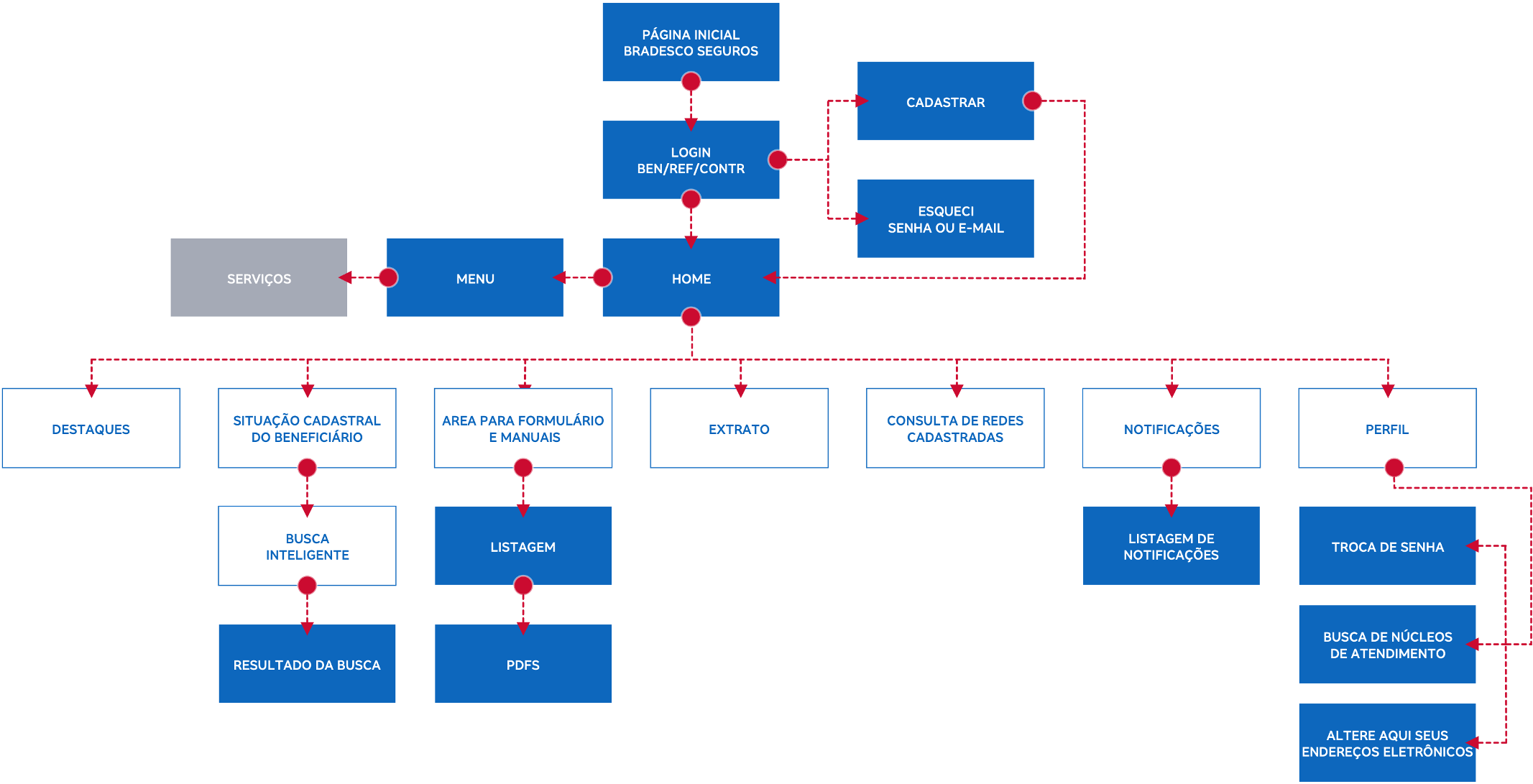
Architecture to be. |
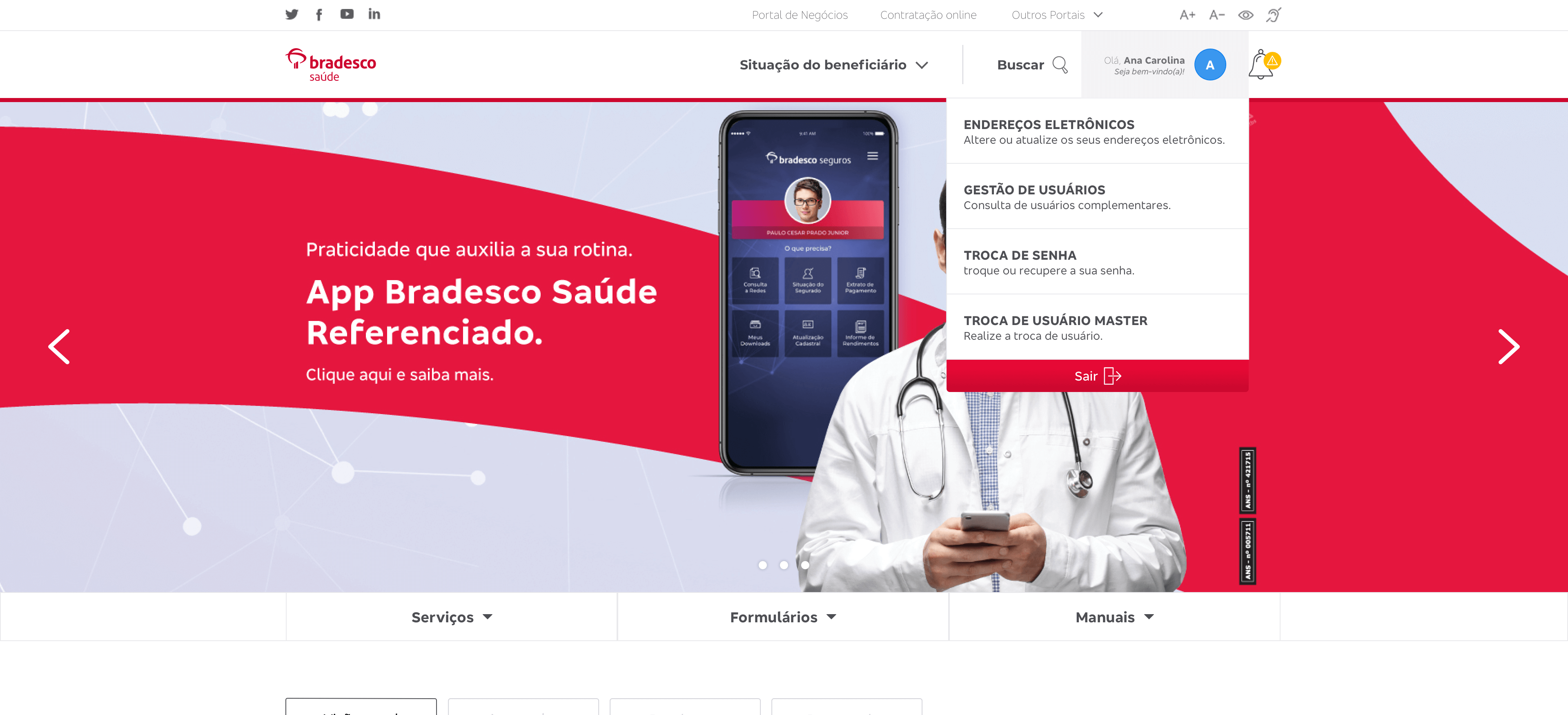
For this first phase we used Bradesco’s user interface guides to create a modern and standard layout, to reorganize the menu, the login area, we created a dashboard so the users can follow their solicitations, we improved the search engine, included accessibilities features, and we created the notification center (to replace the pop-ups).
Final Design
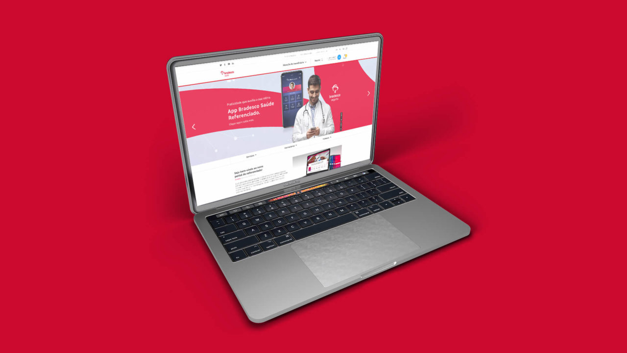
New Home

Notification center subistitute the pop-up alerts

The new menu, more organized and easy to find
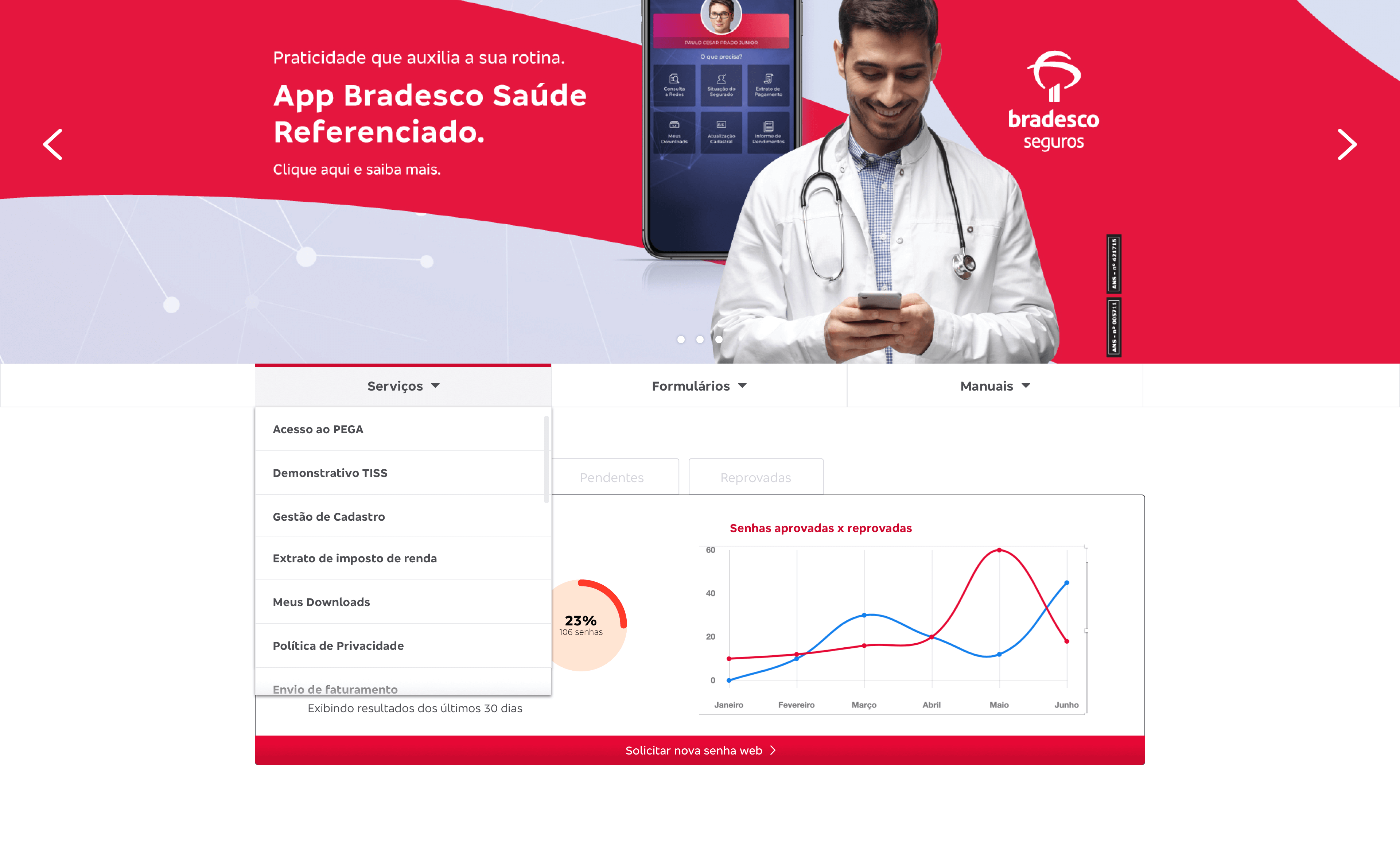
Profile area, with all information doctors need
Next steps
As I said before, we divided the renewing into phases. At the moment we are doing the first release of the first phase. The next step is to validate all the changes and move forward to the next phases.
