
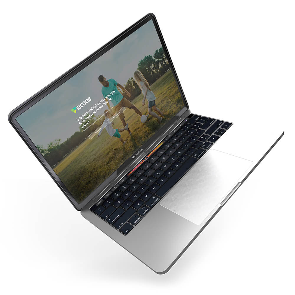
Sicoob National Website
-
ClientRikarin
-
DateJune, 2014
-
CategoryBranding
Overview
Sicoob is the biggest financial cooperative in Brazil with more than 5 million clients and more than 3 thousand offices. In their business model, each singular cooperative is independent and because of that in 2018, there were more than 350 websites. Each one with its own visual lines and technology.
🛠 Role: I lead this project and also worked as UX/UI Designer and product owner.
The Project
After identifying the problem of having 350 singular’s websites, we decide to create a portal of sites and bring all of them to one place, with one single layout and architecture to provide a unique and solid brand/design image. The goal of the project was to built a platform where all singular cooperatives could build their own website according to our layout rules, adding some personal information and images.
Discovery and Research
Here in Brazil, we have some solids examples of websites that use the same architectural structure that we were looking for and I started researching some of them. I’ve found some examples in the telco industry.
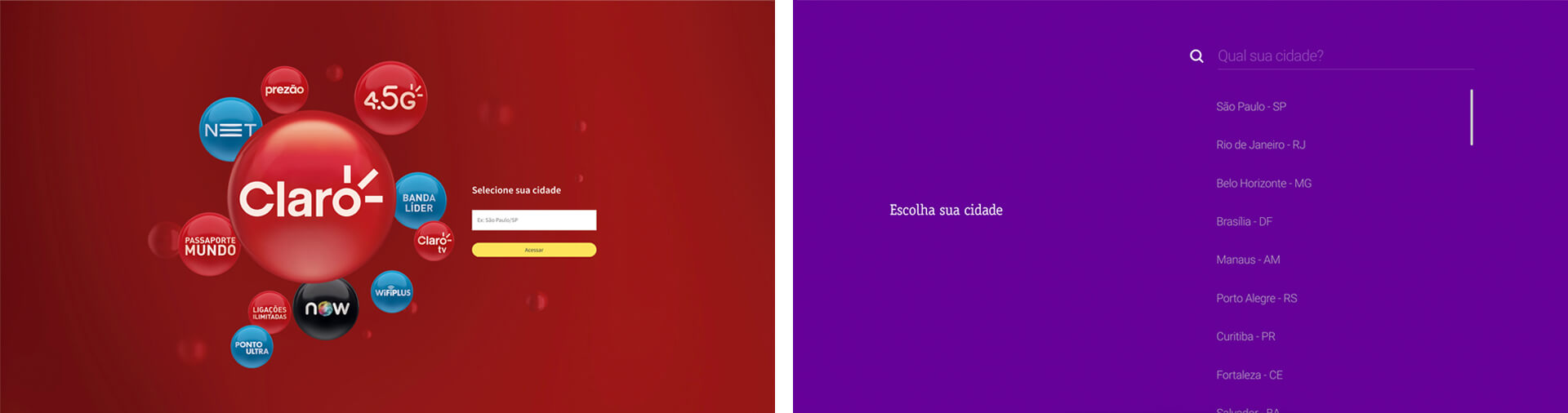
Telco examples. All rights reserved to their respective owners.
They used to use a state division, but we couldn’t do that. In our case, we had more than one singular cooperative in each state. We could use geolocation neither because we have cooperatives really close to each other. Another problem is that we have three different types of clients (regular, business, and rural) with different products and information for each one.
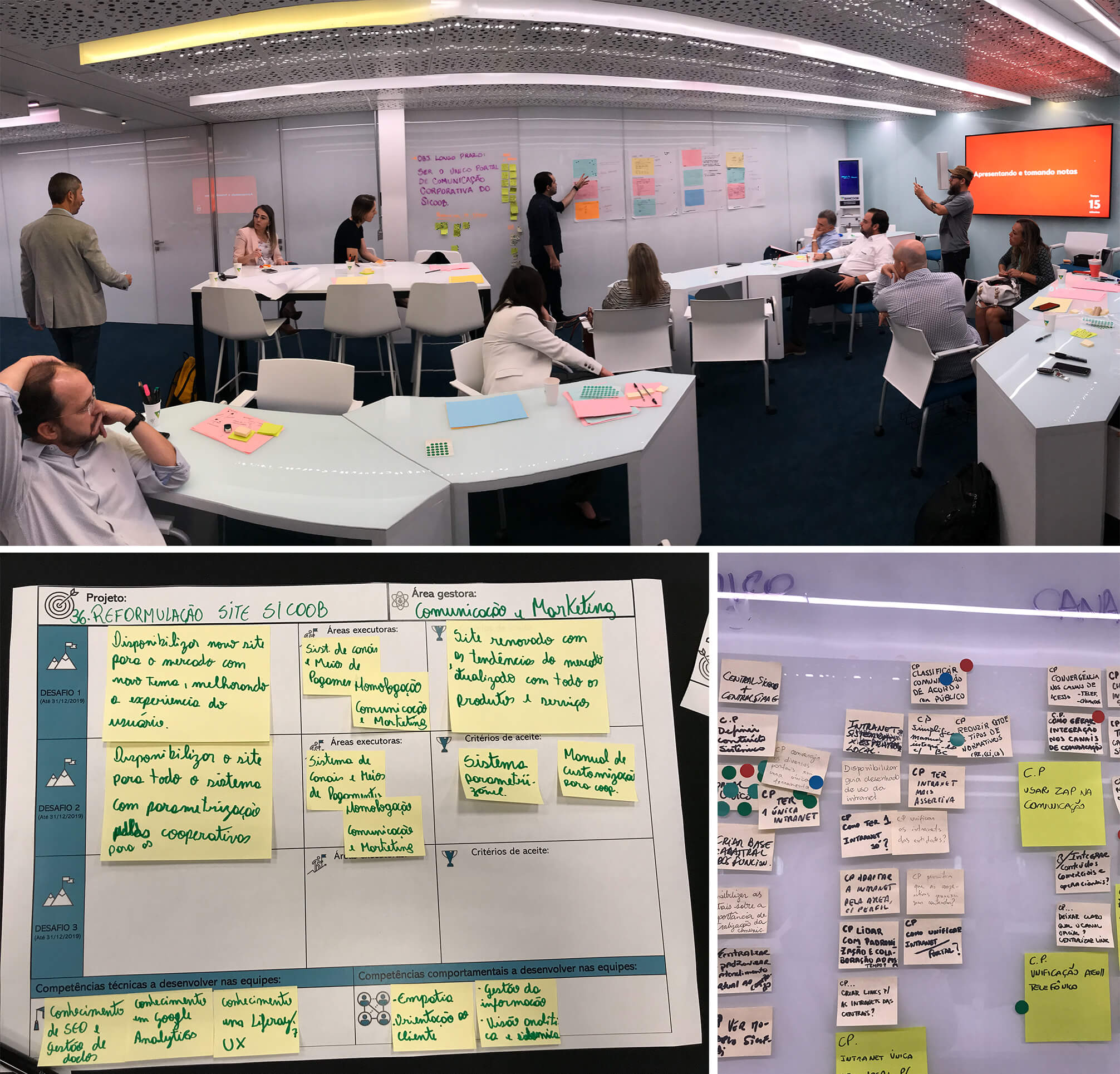
I also did some research with our “internal clients” the singular cooperatives. In order to move all their websites to our portal, we must cover all necessities that they had, and it was a real challenge. With this research, we’ve discovered a lot of different systems, features, and requirements from the singulars. I lead a workshop to help in our discovery process.
Designing and Developing
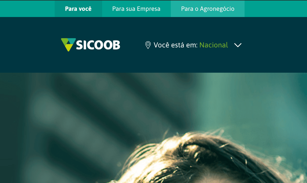
Ok, let’s bring 350 sites into one portal. But how the client is going to chose with one he wants to access? As I’ve already said before, neither state nor geo-localization were an option for us.
So, we decide to build an experience where at the first access the client inform their account number and we recognize which site we need to redirect them for. If they didn’t inform us of any account number, we redirect them to a national “generic” website. We also kept monitoring their navigation while they are surfing on the national generic website and if they input some account information somewhere, we can also redirect them later.
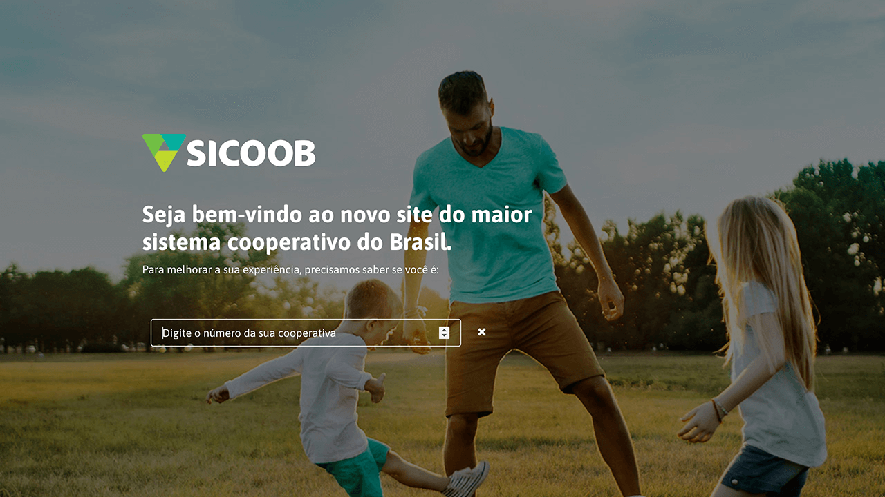
At the first access, we ask the user to input their account number so we can redirect them to the right website. |
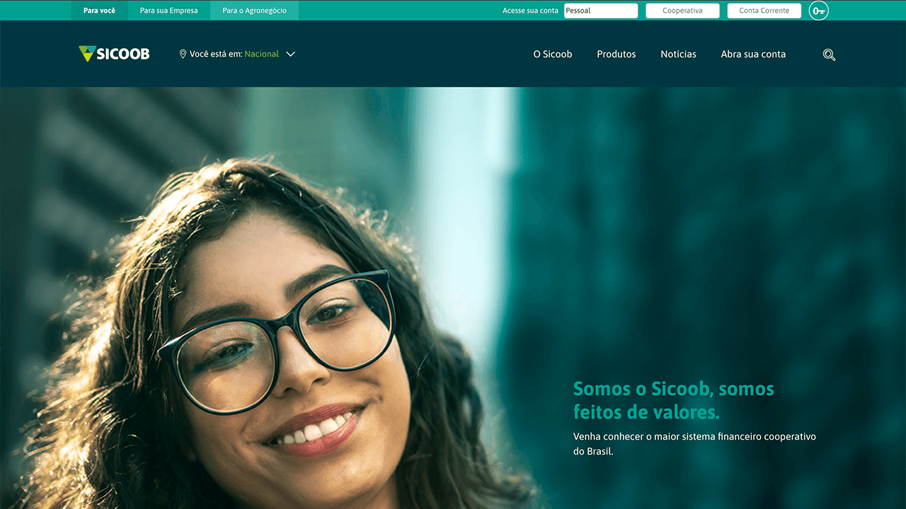
If the user didn’t input any data, we redirect them to the national website. |
The user could change the website anywhere |
We keep those data on cookies, so when the client comes back to access the site later, they needn’t inputting that information again.
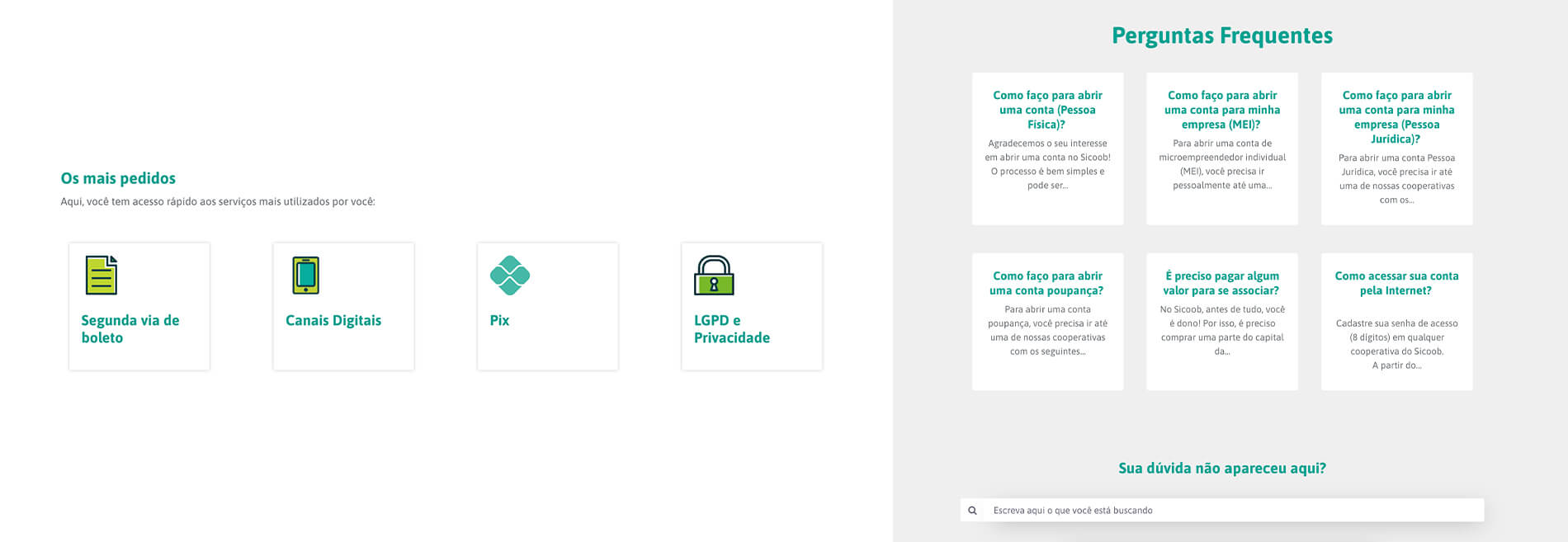
Talking about data.. we’ve decided to do a website that fits our client’s needs. For example, in the quick access section, we show the pages that the client uses most, according to their navigation. We also did that on the FAQ (frequently asked questions), bringing to first the most access questions.
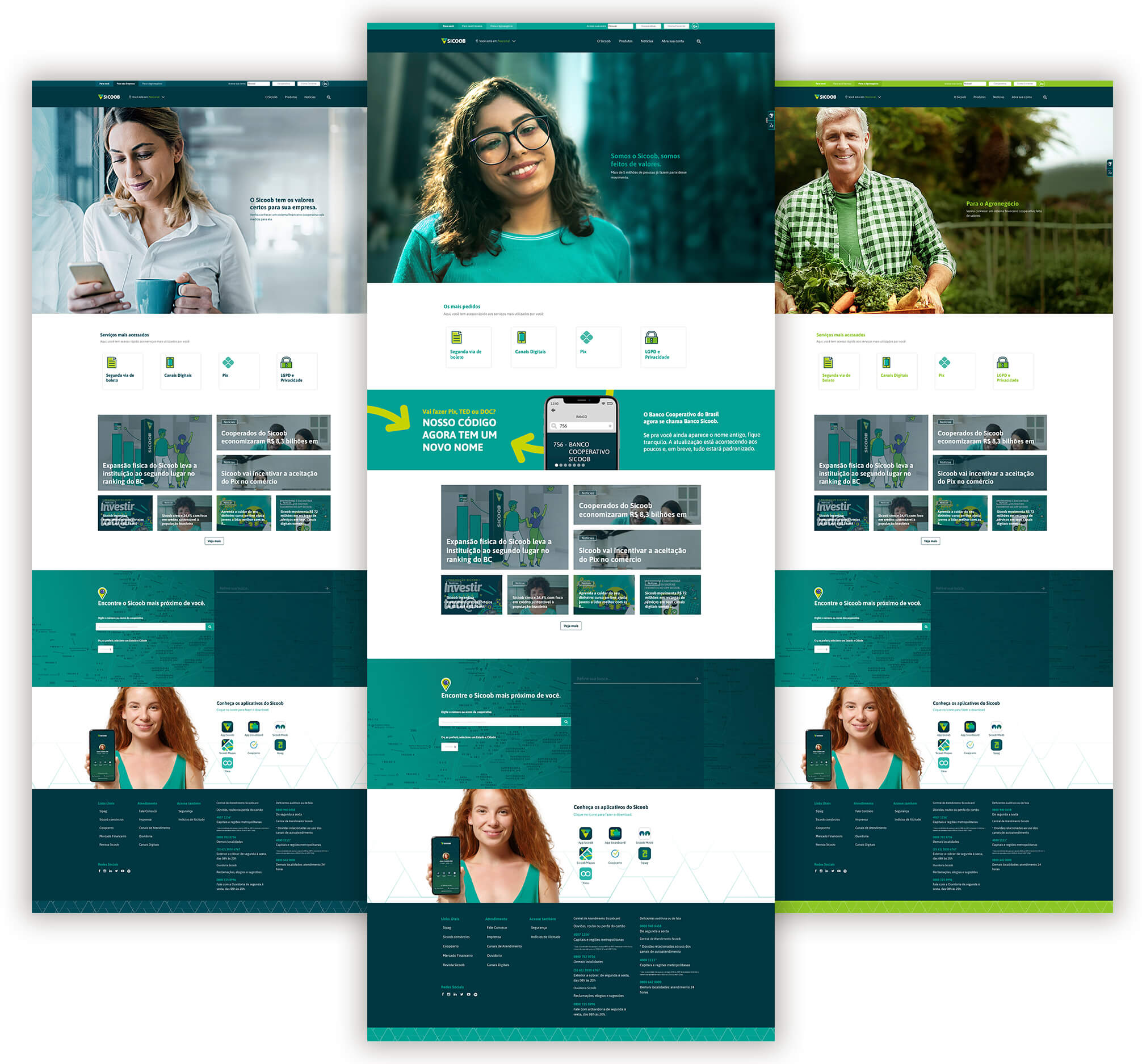
I also created some sections on the website accordion to the user’s profile. For example, if you are a business client, you can access the “For your Business” section and the website only show information, news, marketing campaigns, and products related to that kind of client. Changing the profile also changed the voice tone (type of language and words), photos, and color palettes, everything aligned with our branding guidelines so, if you grab some leaflet on the street related to business content, the website will show to you a similar experience. That data was also kept on cookies, so when the business client went back on the website, he would access his chosen profile.
Results
Working on this project was a watershed to me because I was able to practice a whole pack of skills that I haven’t had before. I “not only” designed the interface, but I also lead all aspects of it. I was responsible to deal with the development team, with our internal clients, to manage deadlines, roadmap, and new features.
It was a success also for Sicoob. All singular cooperatives participate in the project. We needed to do a migration roadmap because of the high number of websites to build. To keep things organized I did a dashboard with all the information related to that: the line, the percentage of migration, and the schedule. I also did a tutorials portal, to help them get used to this new website.
But the results were not only related to that. Despite all branding and design, we achieve some security benefits. During the interview process, we discover some fraudulent websites using Sicoob’s brand. Back then it was an easy thing to do because of the lack of brand/design standard. We also had benefits related to information: with the new portal system, the information, campaigns, and marketing updates becomes faster.
