Sicoob’s Branding Guideline Website
-
ClientRikarin
-
DateJune, 2014
-
CategoryBranding
Overview
Sicoob is the biggest financial cooperative in Brazil with more than 5 millions clients and more than 3 thousand offices. In 2019 they updated their Branding Guidelines, with new instructions ranging from advertising to branch architecture layouts. So to help that transition and inform their marketing employees we created this website with a summary of the branding book.
🛠 Role: UX/UI Designer, motion graphics artist.
Research & Discovery
The brand book is a document with more than 150 pages, with detailed instructions. How do we summarize all this information in a single page with a simple understanding?
I started by talking with the marketing analysts who were responsible to create the book and also to giving support to people who had doubt. They tell me that everything is important and must be on the website. So I ask them a different question: which are the topics of the book that people most often call you to ask about? The itens that cause more doubt?
And after that change of perspective, we started to build the website.
Designing & Developing
I didn’t had the right time to do research, so I started to talk with some users (marketing analysts from our external branches) in a informal way by phone, and they gave me some useful insights. I realize that the information at the book were so dense and hard to read.
It’s really hard to found something at the book, so I prefer call you guys to ask any question, is easier.
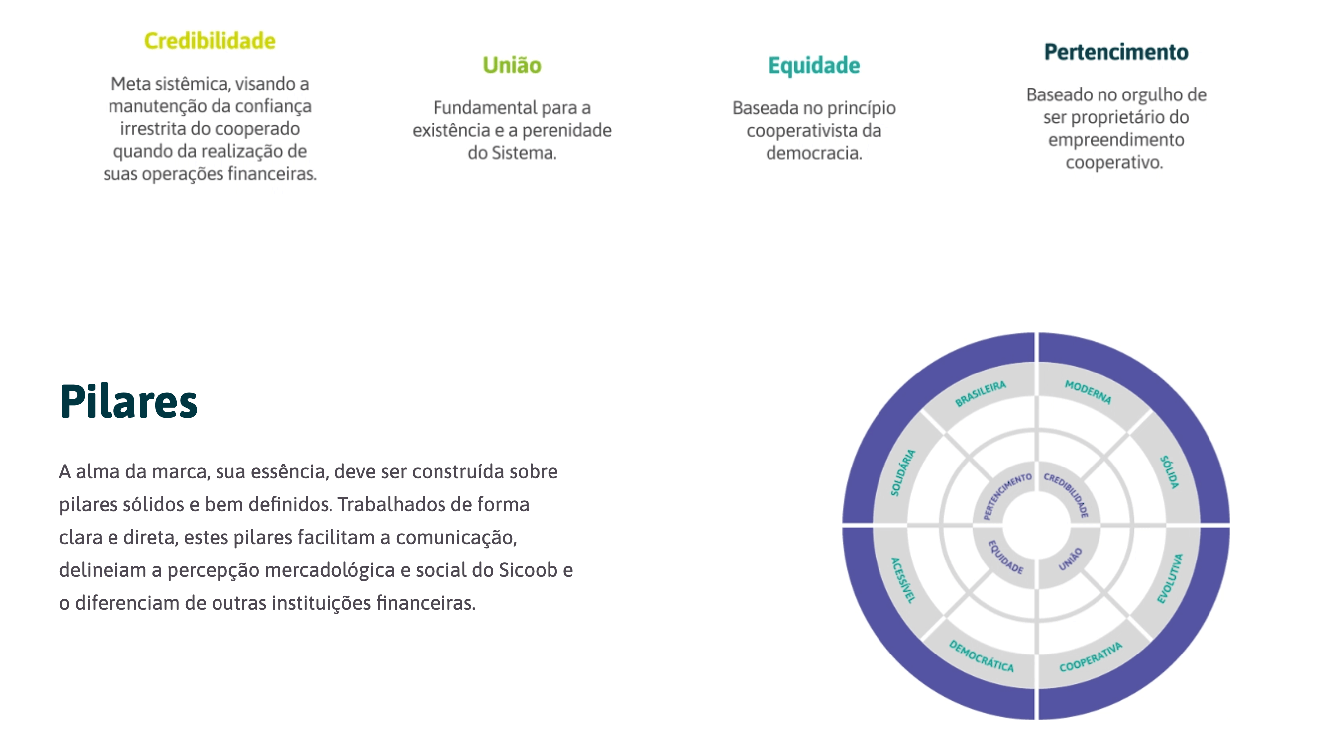
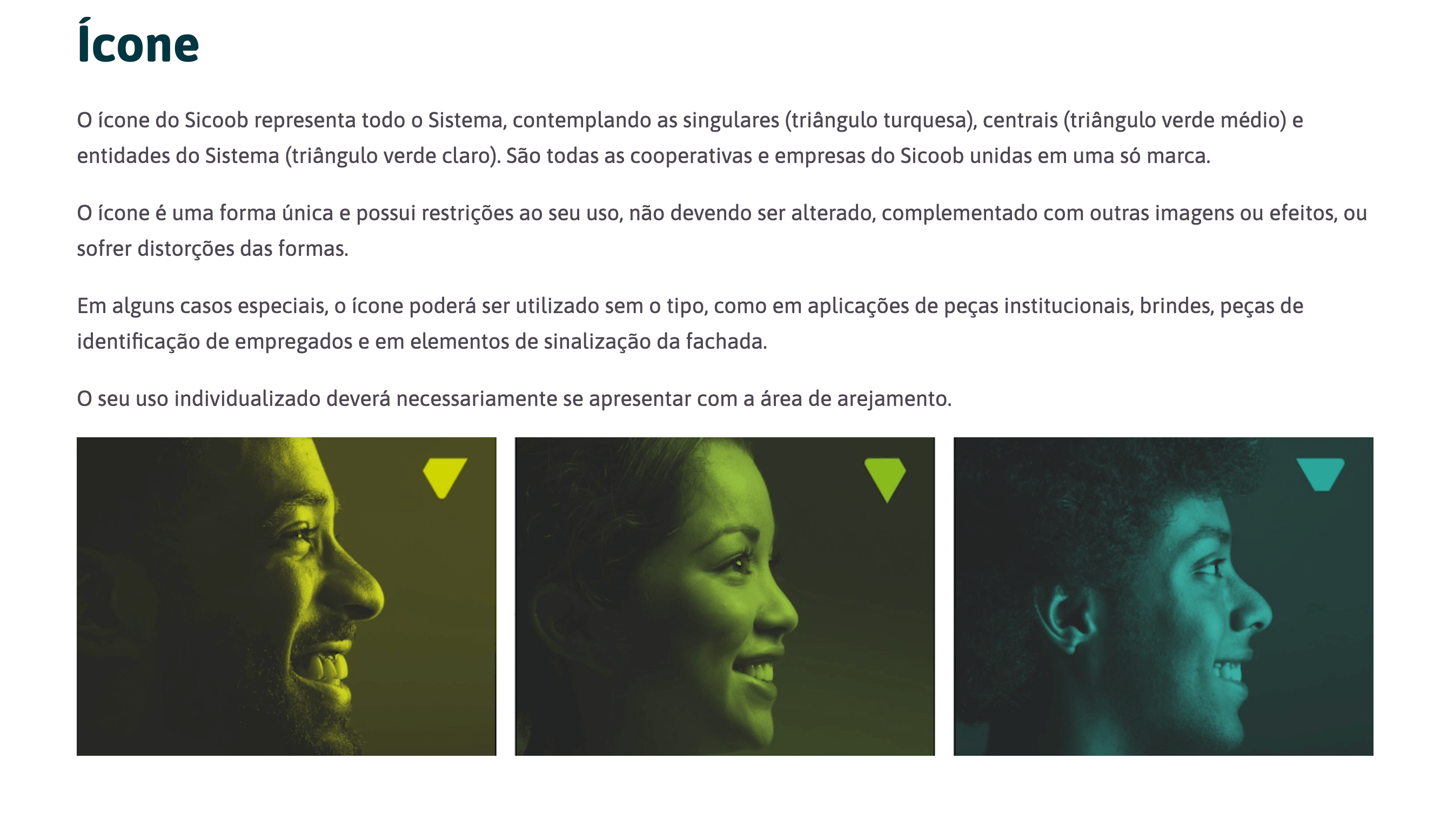
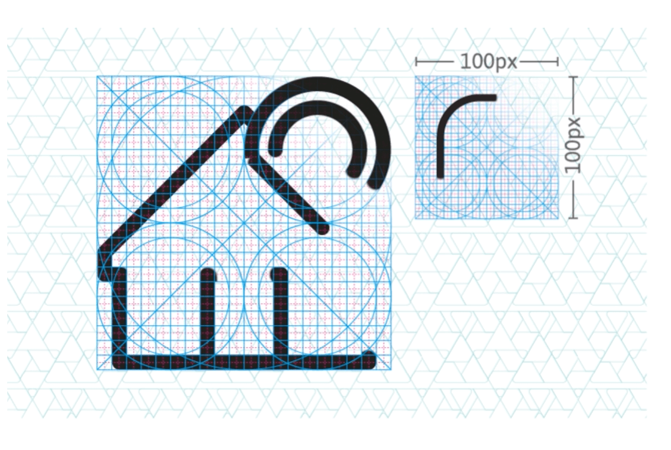
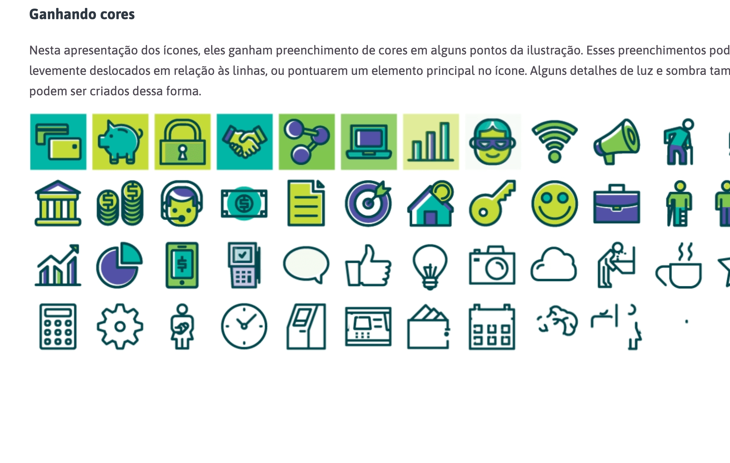
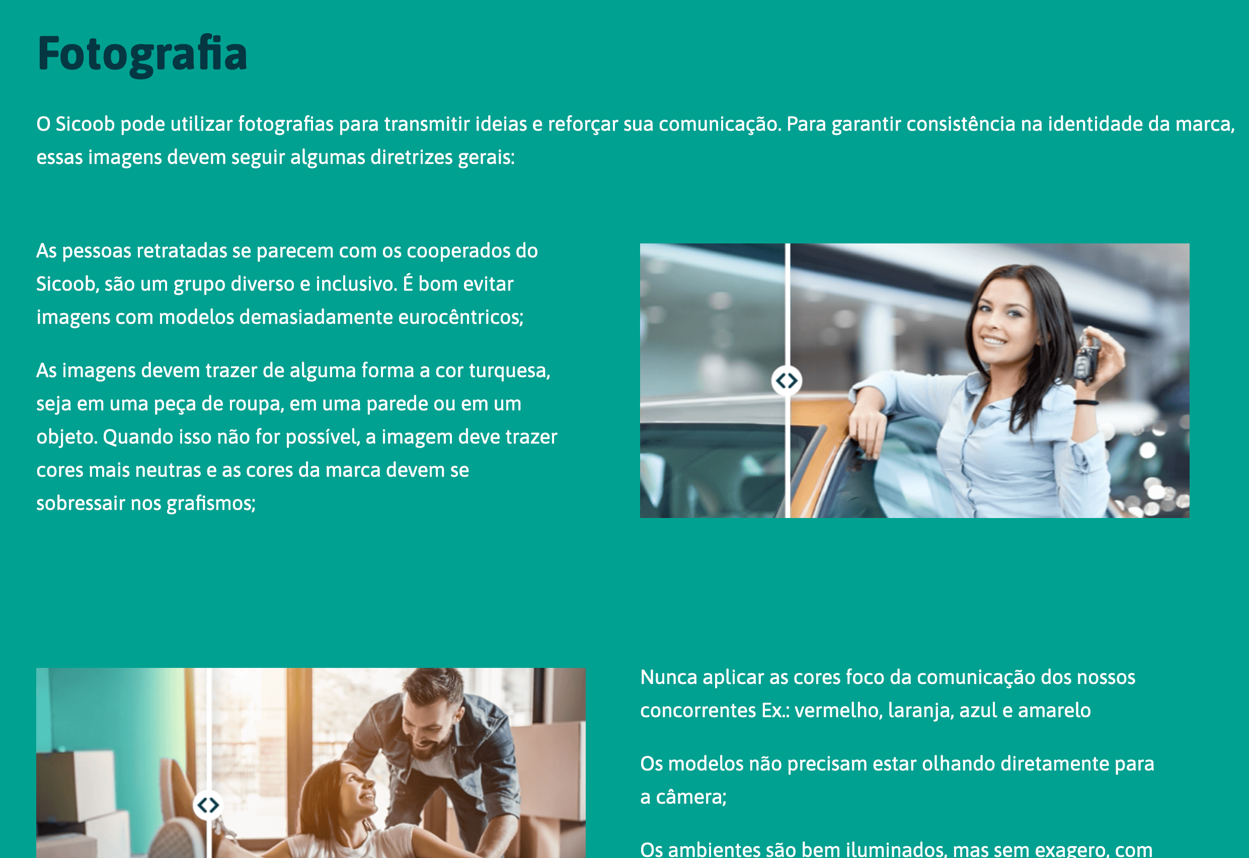
So I tried to create show the information at the website in the most simple and fun way, but keeping the informative aspect. The solution I found was to mix images and animated graphics (also gifs). By doing that I transformed the dense content something light to learn.
You can see some of the images below, at the video on the top of the page or checking live at http://www.sicoob.com.br/marca.