
Sicoob’s Opening Account App
-
ClientFukarin
-
DateMarch, 2015
-
CategoryGraphic
Overview
Sicoob is the biggest financial cooperative in Brazil with more than 5 millions clients and more than 3 thousand offices. Because of their business model (cooperative), they were passing through a hard moment with their opening account app. The journey was poor and with lack of information, which caused a high number of complaints by customers. So, my team and I propose a renewal for the app.
🛠 Role: UX/UI Designer and facilitator.
Research & Discovery
To give a little more context, the app (old version) was made by another team and we (as marketing team) decided to propose a new experience to our customer. We decided to deliver this idea in one week, so we didn’t have much time to do the classical UX process. As I said, I was part of the marketing team, so we started with some social media and call center feedback, a fast and reachable type of data that we could extract some insights from. We also talked with the owners of the app (PO) to understand a little bit more about the whole process and how we can improve it.
We discovered that the biggest problem was the lack of information related to account opening. The app didn’t show clear information about the account number, the branch address and things like that. And, as I said before, Sicoob had a complex cooperative business model. Imagine that in your neighborhood there are 2 Sicoob’s agencies, it could be one in front of another, but they are from different “central offices”. This is really hard for the general user to understand. So, after opening an online account and missing some information, they looked for a physical agency, but as I told before, they are from different “centrals” and can’t provide information for the customer. That causes a huge problem for us.
Designing & Developing
As I said, we only had one week to design, prototype and present the project. So I decided to do a “short design sprint”, in two days. To feel the user’s pain we all tried to open an account as the first exercise and also to know more about the app’s flow. After some debate about the problems, we started to build the new journey.
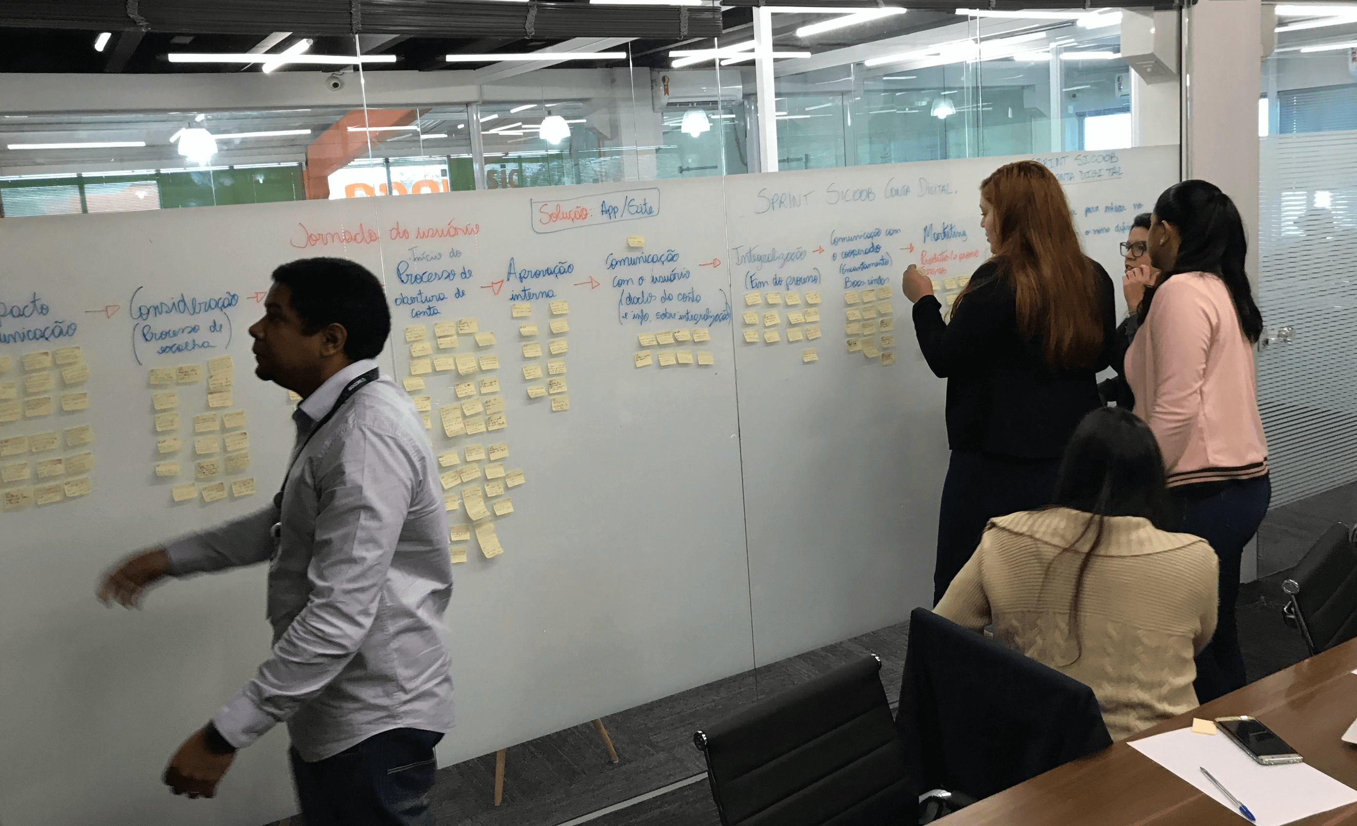
We started by reformulating the journey.
Later, we started to create questions about how we can improve each step of the journey. Not only about screen/user interface, but also business and process. We put all these ideas at the wall, each one in your respective step of the journey, with no judgement, all ideias were valid. As you can see on the picture above, after some immersion, we had a lot of ideas to improve the app. We also created a list with the strong points about our competitors, to keep in mind what kind of feature/process we could use in our journey.
To focus on the biggest questions we voted on the most importants, the ones that will solve more problems and reduce the user’s pains. With all that information on hands, we started to sketch solutions to solve those questions. We tried to address and solve all problems that we identify. In pairs, everyone on the team participates!
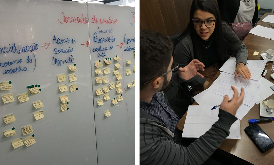
After some hours sketching each pair presented their idea, explaining their point of view, features and their concept. It was enlightening because we can see the journey through new eyes, under a new perspective. After all pitches, we started a new vote session, to decide the best features/improvements and start to prototype the project in high fidelity. In that type of dynamic, there isn’t a winner. We all built the project together, as a team. The final product is a result of everybody’s effort.
With all those insights and sketches, we built the “perfect journey” and I prototype the app (which you can see on the top of the screen).
